What is POS user interface: a guide for UK businesses

TL;DR:
- The POS user interface is a critical front-end that directly impacts transaction speed and staff accuracy, yet it is often overlooked in system selection. A well-designed UI simplifies workflows, reduces errors, and enhances operational efficiency during peak times, which benefits both staff and customers. Careful evaluation of UI layout, customisation options, and hardware compatibility is essential to choosing a POS system that truly supports business needs.
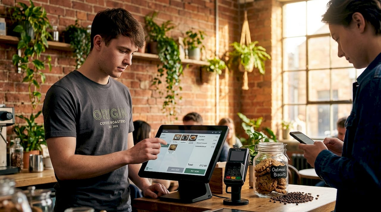
The POS user interface is one of the most consequential decisions a retail or hospitality business owner can make, yet it is frequently overlooked in favour of hardware specs and pricing. A common misconception is that the “POS UI” is the whole POS system, when in reality it is the front-end screen environment your staff interact with during every single transaction. Get it wrong and your team will be slower, your error rate will climb, and your customers will feel it. Get it right and you will be surprised how much smoother peak service becomes.
Table of Contents
- What is a POS user interface and why does it matter?
- Core components of POS user interfaces in retail and hospitality
- How POS UI design affects operational efficiency and error reduction
- Adapting POS UIs to hardware and operational contexts in UK retail and hospitality
- Evaluating and choosing a POS user interface for your business needs
- Why focusing on POS user interface nuances can transform your retail or hospitality business
- Explore YCR Distribution’s expert POS hardware and software solutions
- Frequently asked questions
Key Takeaways
| Point | Details |
|---|---|
| POS UI distinction | The POS user interface is the front-end staff use, distinct from the back-end transaction processing system. |
| Efficiency boost | An efficient POS UI layout reduces transaction times and errors, improving staff performance and customer experience. |
| Hardware adaption | POS UIs must adapt to different hardware sizes and device types to maintain usability across setups. |
| Evaluation focus | When choosing POS systems, prioritise UI workflows that support frequent tasks with minimal steps and clear controls. |
| Practical impact | Investing in POS UI design can deliver operational improvements beyond hardware upgrades alone. |
What is a POS user interface and why does it matter?
At its core, the POS user interface is the visual layer staff see on the screen when they are processing a sale. It is the collection of buttons, menus, input fields, and screens that a cashier or server navigates to complete a transaction. The POS UI is the on-screen set of controls staff use to run transactions, distinct from the back end that handles data processing, stock management, and reporting underneath.
Many business owners conflate the two, assuming that if the system has the right features, the interface will naturally be good. That is not how it works. A POS system can have powerful back-end capabilities and still present a cluttered, confusing screen that slows every transaction by 30 seconds. In a busy lunch service or a weekend retail rush, those 30 seconds stack up fast.
Understanding why use POS systems in the first place makes the UI conversation clearer. The entire point of a POS is operational efficiency and accuracy. If the interface undermines those goals, the system fails at its most basic purpose.
Here is what the POS user interface typically governs:
- The layout and arrangement of buttons, menus, and product categories on screen
- The workflow steps staff follow to build a sale, apply discounts, and collect payment
- Visual feedback that confirms actions, flags errors, or prompts next steps
- Access to functions such as refunds, voids, receipt options, and shift reports
- The appearance and behaviour of the system across different device types
Core components of POS user interfaces in retail and hospitality
With an understanding of what constitutes the POS UI, let us explore its essential parts and how they help your team process sales accurately and quickly.
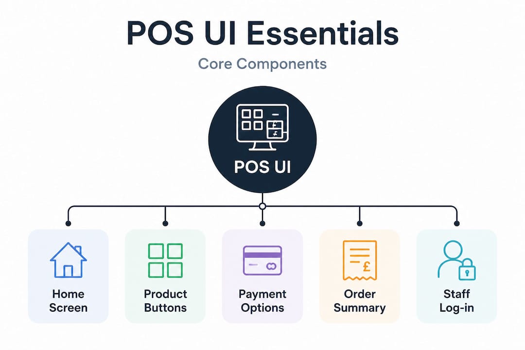
POS screen layouts generally include a Welcome screen for accessing operations and a Transaction screen for processing sales, with configurable controls that can be arranged to match your specific workflow. These two screens form the backbone of most POS UI experiences.
The Welcome screen is where staff begin their shift, log in, and access key operational areas. It often contains shortcut buttons for common functions, shift management tools, and access to table plans in hospitality or department views in retail.
The Transaction screen is where the real work happens. This is the screen your team will look at hundreds of times per day. The POS UI involves touchpoints for building customer carts, processing payments, and generating receipts, all within a single, usable sales flow. Typical controls here include:
- Product entry buttons grouped by category, allowing staff to tap items directly
- Barcode scan input for retail environments where scanning is the primary entry method
- Quantity and modifier options for restaurants needing to specify portion sizes or customisations
- Payment type buttons covering cash, card, contactless, split payment, and vouchers
- Line item management for removing, editing, or discounting individual products
- Receipt and output options for printed, emailed, or no-receipt preferences
Understanding POS system UI at this level matters because each control is a potential point of friction or fluency. A well-organised Transaction screen means your staff spend zero time hunting for the right button during a queue.
Pro Tip: When evaluating a POS UI, time how many taps it takes to complete your three most frequent transactions. If any of them require more than four or five steps, that is a red flag worth raising with the vendor before you commit.
How POS UI design affects operational efficiency and error reduction
Now that you know the UI components, let us understand how its design directly impacts your business performance in everyday operations.
Small layout decisions, such as placing frequent actions on the same screen path with minimal steps, can materially impact transaction speed and error rates at the till. This is not abstract UX theory. It is the difference between a staff member completing a payment in four taps or ten.
Consider a busy café. If applying a loyalty discount requires navigating three menus, staff will start skipping it under pressure, leading to customer complaints and lost retention data. If that same action is a single button on the main Transaction screen, it happens automatically, every time.
The table below illustrates how specific POS UI design principles translate into measurable operational outcomes:
| UI design feature | Impact on transaction speed | Impact on error rate |
|---|---|---|
| Categorised product buttons on main screen | Faster item entry, no search required | Fewer wrong item selections |
| One-tap payment type selection | Reduces payment processing time | Minimises wrong tender type errors |
| Visual confirmation prompts | Slight pause for confirmation | Significantly reduces accidental voids |
| Modifier pop-ups for hospitality | Minor added step | Prevents incorrect order customisations |
| Logical screen flow (item, quantity, payment) | Reduces cognitive load per transaction | Lowers training-related mistakes |
| Cluttered or unlabelled buttons | Staff hesitation at every step | Higher rate of wrong selections |
The best practices for POS user interface design consistently point to the same principle: match the screen layout to how your staff actually work, not how the software developer imagined they might.
Pro Tip: During any POS demo, ask to complete a typical transaction yourself without any guidance from the sales representative. If you struggle to find the right buttons without coaching, your staff will too.
Pairing good UI design with the right retail POS best practices around staff training and workflow processes compounds the benefit significantly.
Adapting POS UIs to hardware and operational contexts in UK retail and hospitality
Having covered the impact of UI design on efficiency, let us examine how different hardware and environments affect the UI choices your business should make.
Not every POS UI needs to look the same. In fact, a one-size-fits-all screen layout is often a sign that the system has not been properly thought through for real-world use. POS screen layouts often require multiple layout modes, such as full or compact and portrait or landscape, to fit different hardware and counter setups, which makes tailored UI design an operational necessity rather than an optional extra.
Here is how hardware context shapes the UI decisions you should be considering:
- Full-size counter terminals suit expansive layouts with large product grids, multiple payment buttons, and customer-facing screens. These are common in retail checkout lanes and restaurant front-of-house stations.
- Compact countertop units need stripped-back layouts prioritising speed over breadth, with only the most common functions immediately visible.
- Handheld mobile devices used for tableside ordering or queue-busting require portrait-mode layouts with touch-friendly targets, simplified menus, and offline capability.
- Self-service kiosks demand an entirely different UI philosophy, with larger text, clear imagery, and no reliance on staff-style shortcut knowledge.
The table below outlines common hardware types and the recommended UI approach for each:
| Hardware type | Typical use case | Recommended UI layout mode |
|---|---|---|
| Full-size POS terminal (15") | Retail checkout, restaurant till | Full landscape with expanded product grid |
| Compact countertop unit (10") | Café counter, small retail | Compact landscape, reduced category depth |
| Android tablet (8"–10") | Tableside ordering, pop-up retail | Portrait mode, simplified navigation |
| Self-service kiosk | Fast food, ticketing, convenience | Kiosk mode, image-led, minimal text input |
| Mobile handheld device | Queue busting, delivery management | Compact portrait, core functions only |
Getting familiar with POS hardware terminology before you select a system will help you ask the right questions about UI compatibility across your intended devices.
Evaluating and choosing a POS user interface for your business needs
With an understanding of hardware and UI design, here is practical guidance on choosing the right POS UI for your specific operation.
Evaluating POS UIs goes beyond appearance. The workflow steps, usability for frequent tasks, and the distinction between front-end UI and back-end processing all need to form part of your assessment before you sign anything.
Follow this checklist when assessing any POS user interface:
- Complete a transaction yourself. Do not just watch a demo. Process a typical sale, apply a discount, and take a card payment. Count the steps.
- Ask about layout customisation. Can you rearrange buttons, change categories, or add your own shortcuts? Rigid layouts that cannot be adjusted to your menu or stock will create friction long term.
- Test on your intended hardware. A UI that looks great on a showroom 15-inch terminal may be unusable on a 10-inch tablet behind your café counter.
- Request access to the back-end reporting UI too. The interface your managers use for end-of-day reports and stock adjustments matters as much as the till screen.
- Ask about staff training support. A good UI reduces training time, but check whether the vendor offers onboarding materials, video guides, or in-person support for your team.
- Check for update and customisation history. Ask how often the UI is updated and whether changes are pushed without warning, as unexpected interface changes can disrupt trained staff overnight.
- Understand the integration points. Ensure the UI connects cleanly to your kitchen display systems, receipt printers, scanners, and any loyalty or EPOS back-end you already use.
A thorough evaluation process is what separates a good POS investment from a costly one. For broader guidance on how to choose a POS system in the UK, taking a structured approach ensures you compare like for like across vendors.
Why focusing on POS user interface nuances can transform your retail or hospitality business
Most businesses shopping for a POS spend the majority of their time comparing hardware specs, contract terms, and monthly costs. The UI is often treated as an afterthought, something to be tidied up after installation. That is a costly mistake.
POS UI redesign projects that align with real transaction flows reduce mental load and errors for staff, leading to noticeably smoother peak time handling. The phrase “mental load” is doing real work there. During a Friday evening service or a Saturday retail rush, your staff are already managing customer questions, stock queries, and timing pressures. A UI that demands active thought at every step adds to that burden invisibly, and the consequences show up in longer queues, higher error rates, and staff frustration.
We have seen businesses invest in new hardware, faster broadband, and even additional staff, when the actual bottleneck was a confusing transaction screen that nobody had bothered to reconfigure since installation. A thoughtful UI audit, often involving little more than reorganising button layouts and reducing menu depth, can outperform a full hardware upgrade in terms of measurable transaction throughput.
The role of POS in retail extends beyond the till. It shapes how your staff feel about their work, how your customers experience checkout, and how confidently your managers can interpret the data coming out of the system. Investing attention in the UI is not a technical detail. It is a business decision.
Explore YCR Distribution’s expert POS hardware and software solutions
Understanding what makes an effective POS user interface is only the first step. Putting the right system in place is where the real difference is made.

At YCR Distribution, we have spent over three decades helping UK retail and hospitality businesses find the right combination of hardware and software to match their operations. Our range of POS software solutions includes SAMTOUCH and EZEEPOS, both designed with practical, configurable interfaces built for the pace of real business. Pair that with our full range of POS terminals from trusted brands including SAM4S and iMin, and you have a system that works from the screen outwards. If you are ready to evaluate your options, explore our POS hardware range or speak to our team directly for tailored guidance on finding the right fit for your business.
Frequently asked questions
What exactly does the POS user interface include?
The POS user interface includes the on-screen controls and screens that staff use to process sales, build customer orders, apply pricing or discounts, and handle payments. The UI is the front-end interface staff interact with to enter purchases, apply pricing rules, and complete payment steps.
How is the POS user interface different from the POS system?
The POS user interface is the front-end used by staff during transactions, while the POS system also includes back-end processing, reporting, and integrations. NetSuite clarifies the UI as the interface associates use, distinct from the back end that handles processing and reporting.
Why is POS UI design important for retail and hospitality businesses?
A well-designed POS UI helps staff complete transactions faster with fewer errors, reducing training time and improving customer experience. Small layout decisions in UI can materially impact transaction speed and error rates at the till, which matters most during peak service periods.
Can POS UI be customised for different hardware?
Yes, many POS systems allow UI layouts to be customised for different device sizes and orientations. POS screen layouts can be designed for various device form factors, including full-size and compact layouts in landscape or portrait modes.
What should I look for when evaluating a POS user interface?
Focus on UI workflows that minimise steps for frequent tasks, clarity of controls, and whether the UI fits your hardware and business processes. Evaluate POS UIs not just by appearance but by workflow efficiency, ease of completing common tasks, and integration with back-end processes.